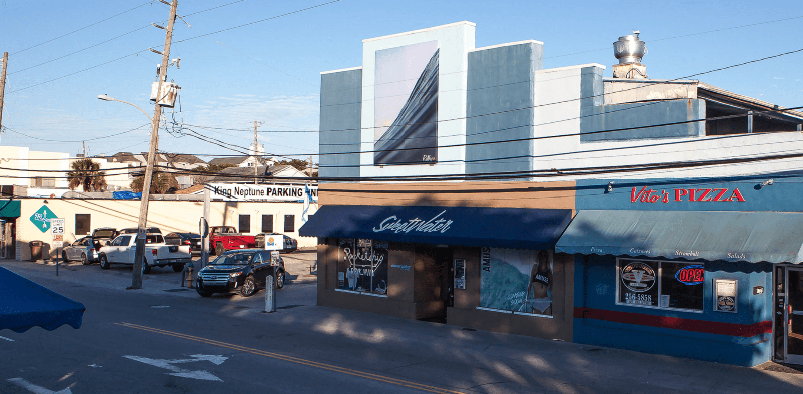
When presented with the opportunity to install any work of my choosing for a billboard size (8’x19′) installation above Sweetwater Surf Shop in the heart of Wrightsville Beach NC, a few major questions came to mind. What am I going to show? What kind of statement do I want to make? How am I going to make the piece fit this unique space? After contemplation, I discovered the answers to these tough questions in the guiding principles of minimalism, forced perspective, and color theory.
minimalism: Given that the space is very large and outdoors, special considerations needed to be made as to how the piece would look when viewed at various distances. Due to this factor, I determined a piece with minimal content structure would be best to extend visual impact to all at multiple distances, so as not to confuse the viewer with content from afar. This “less is more” approach also made sense when considering the necessity of the work to complement the organic line structure of the building. The chosen piece must have strong geometric components.
forced perspective: To hold elements of the modern, I needed to chose a piece that manipulated perspectives when the scale was enlarged. Currently, my methodical approach to ocean photography is centered on the technical use of forced perspective. I implement this technique through the use of unconventional lenses that compress and manipulate the scale of the water in motion. As these images are enlarged, their ability to produce the illusion of size increases with the of the size of the installation. For example, a 2′ wave shot with the applied techniques and enlarged to scale at 18′ in length will hold the visual illusion of an 18′ wave.
color theory: Finally, since the work will be in a predominantly blue environment (the building is blue, the sky is blue, etc.) I determined that a blue monochromatic image would be essential to harmony and flow. A further point regarding the use of blue is that it is recognized as the most preferred color of humans across cultures worldwide when compared to all colors in the color wheel.
Utilizing this self imposed three-point checklist, the work that I need to show became crystal clear to me. See my selection installed above this text and in it’s full frame below.
-Sean D. Ruttkay