Socrates before he drinks the hemlock 399 BC

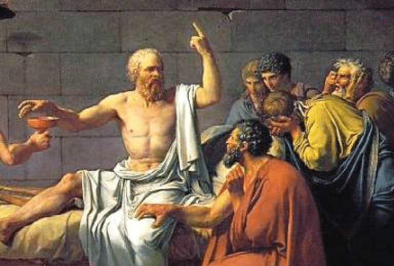
Socrates wearing canvas before he drinks the hemlock 399 BC.

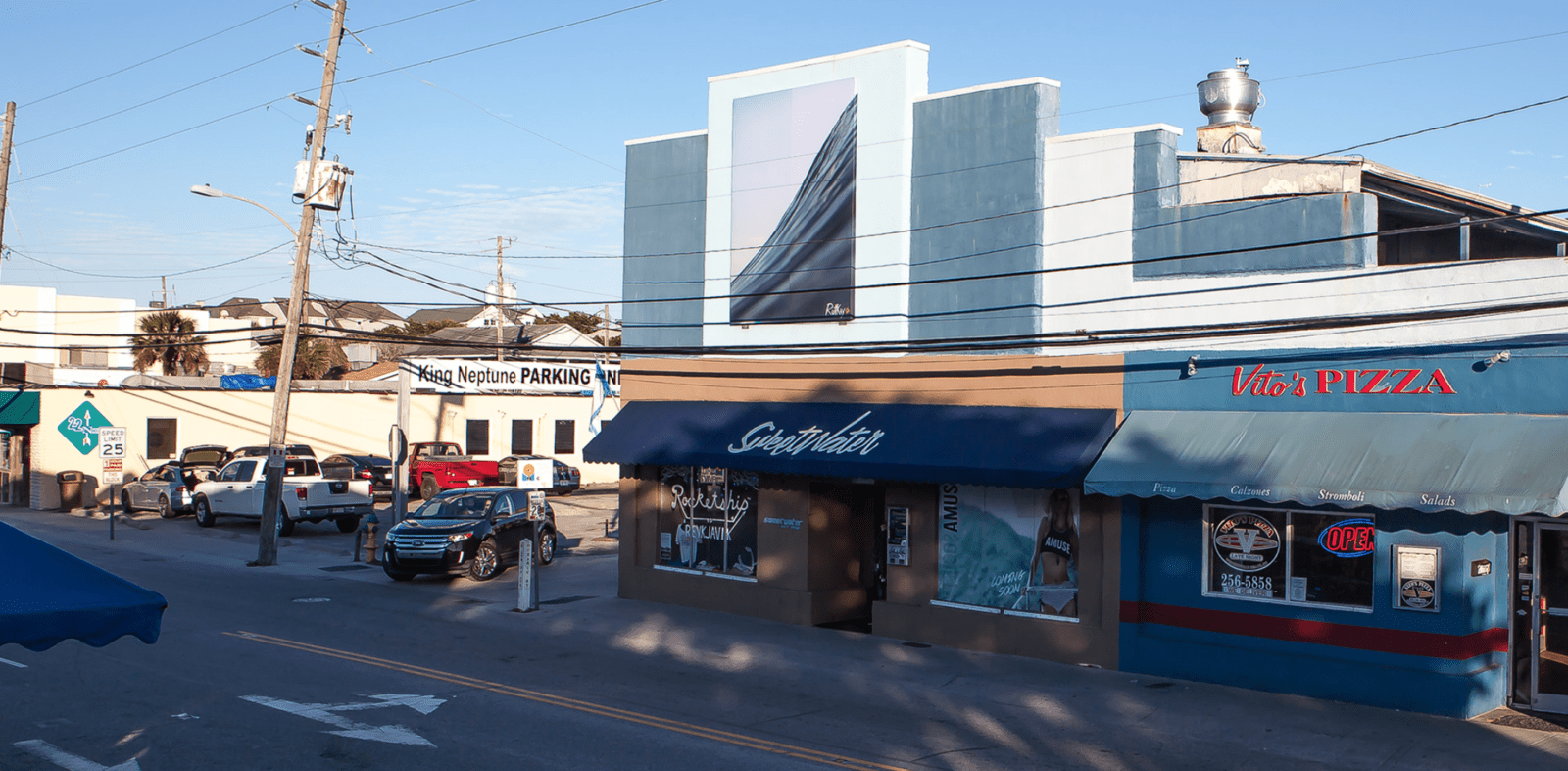
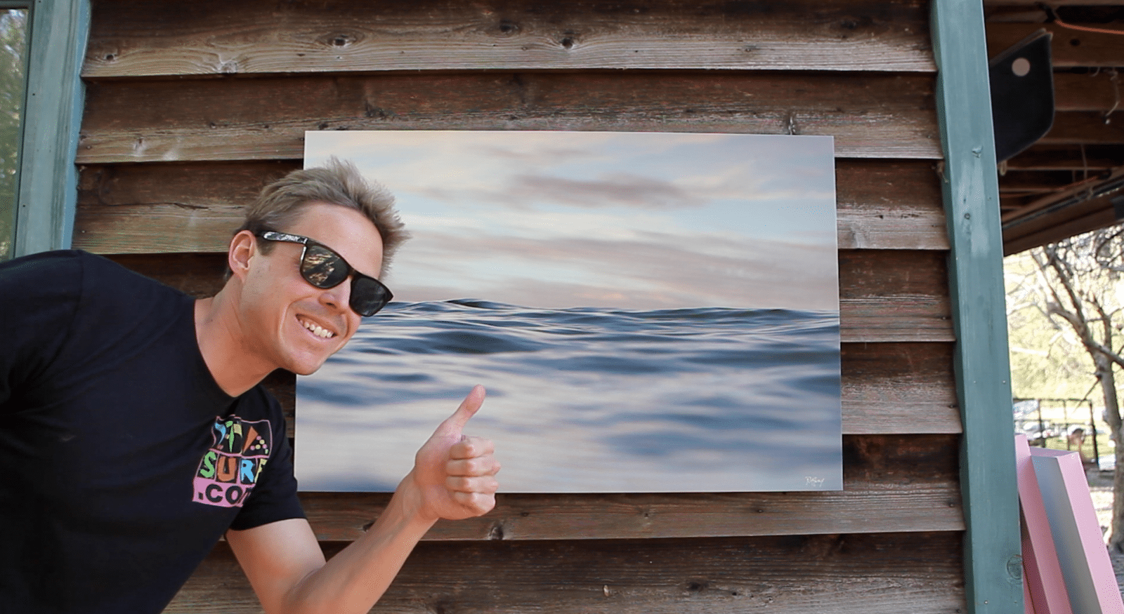
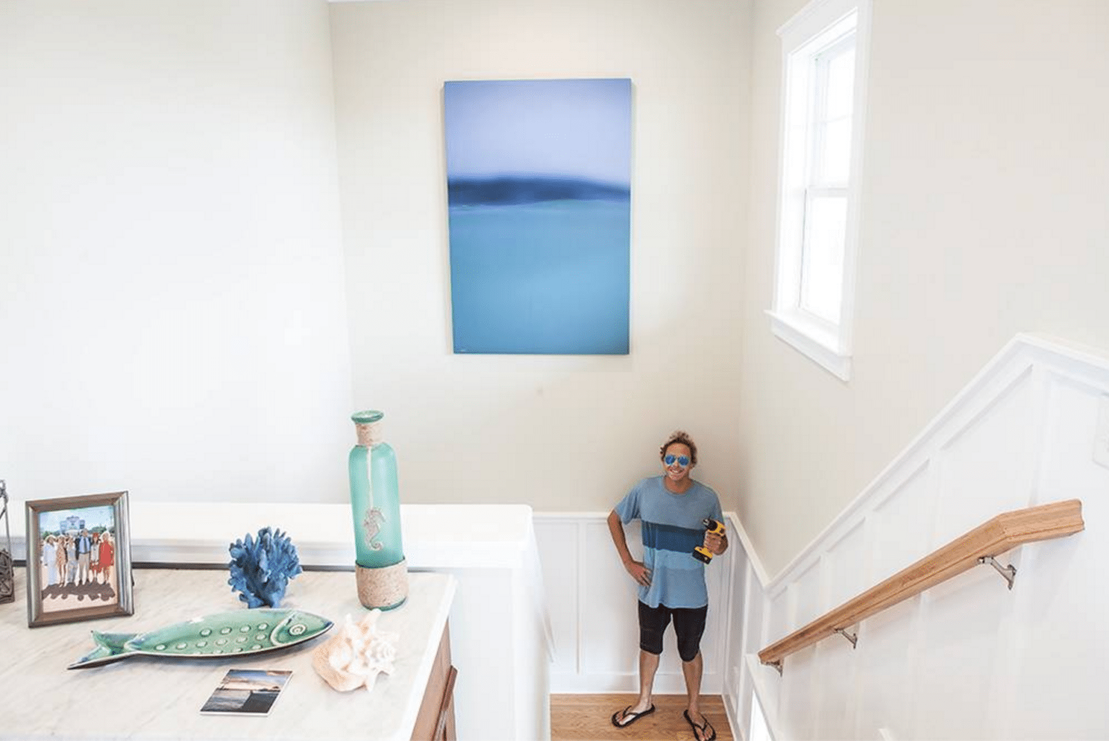
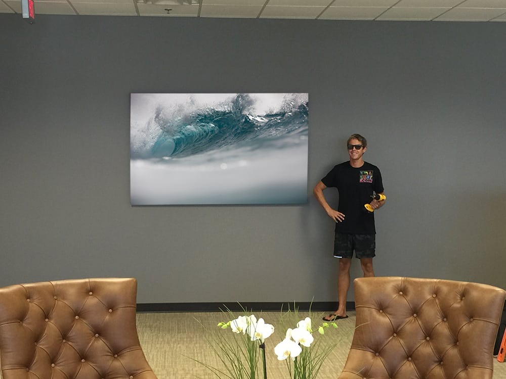
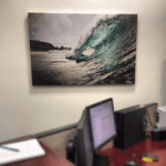
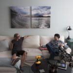
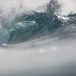
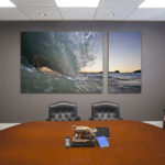
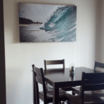
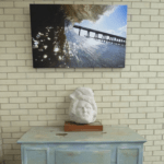
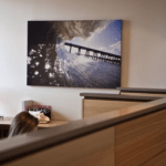
The ancient Egyptians mummified they’re dead with it. The ancient Greek philosophers made robes from it. But it was not till 1400 when Gemäldegalerie painted the Madonna with angels that the French coined the term for this woven linen material as canevas form, the Latin cannapaceus for “made of hemp,” originating from the Greek.  Today, artist canvas is no longer made from hemp but linen and EDA Surf canvases are composed of premium materials. That combined with our state of the art printing technology and modern water visuals will leave the customer with a holistic consciousness enhancing installation. But that’s not all. For a limited time EDASurf is offering these amazing custom pieces for a fraction of our normal cost.  This limited time offer will be available while supplies last. If you take advantage of our free shipping, I guarantee you will be beyond stoked. I’m so confident of this, that this offer is satisfaction guaranteed. So, if you’ve had the desire to water your wall, but your budget has been holding you back, now is your opportunity. Hoping to hear from you shortly.

– Ruttkay / @edasurf


Since the beginning, water has been 60% of our physical makeup.  To find love in the water is to love yourself, everyone you know and the world around you.  It is our universal essence.  And as it is us, we should engage it daily and often.  With vigor, engage it physically through exercise.  With consistency, engage it biologically through consumption. And with focused contemplation, engage water visually.  By engaging in water art, various levels of joy and even bliss will be found.  It is time to lay the welcome mat out to this element called water.  Seek it.  Feel it.  Be it.  Flow.  As this love evolves, consciousness will blast to higher states.  You have been watered.  Now, water the wall.

~ Ruttkay / @edasurf


Before our Surf Art makes it to your wall, all EDA Surf Installations should evolve through three essential stages:

  1. The Assessment

This stage in the development of your installation is the most important.  Here is determined where and what size installation will be most effective.   Ask yourself:  In what room do I spend most of my time?  What room needs to inspire most?  What size and color would flow best with the layout of the room and my other decor elements?

  1.  The Inspiration

After determining the scale of your installation, it is time to focus on what piece of EDA Surf Art delivers the highest degree of impact to you and your personal aesthetic sensibilities.  Are you the type of person that needs a little extra stimulus to get moving? Then you might want to think about installing a wave in your space.  Maybe you are looking for a more calming influence for your space -a place to focus. Then you might want to look at installing a linear, tranquil piece.  Each piece of EDA Surf Art is designed to take the mind of the individual to a state where only focused action follows the viewing experience, thus tapping the fluid natural powers found only in water.

  1. The Delivery & Installation

After your deep thinking in steps 1 & 2, number 3 is a breeze with EDA Surf delivery is free for the month of February and when you receive your exciting new art, hanging will be smooth and simple.  No worries!!

Like the art itself, the steps it takes to your wall are intuitive.  Let’s begin those steps together.

~Ruttkay / @edasurf

P.S. — The videos below are part of a on going film project called called ‘The Lighting Installations’.  In each piece you will see the 3 EDA Surf Installation steps performed in less than 15sec in a variety of different spaces.  Enjoy 🙂


  Our comfort with interior spaces can be a problem in our modern society.  Whether at home, in the office, or a medical environment, much of our time is spent indoors. Due to our shared exterior evolution, this dilemma affects every human who spends a considerable amount of time in the built world. IMG_2129 copyAt EDA Surf we have a solution. Water the wall.  Do this to your modern space and you will feel a subconscious bliss.  Embedded in every piece of EDA Wave Art are natural, holistic, subliminal powers. Customers continually return to our Wilmington, NC Art Studio wanting more pieces based on how they feel emotionally when engaging the water work.  Some say certain pieces, like those of the ‘Seascape Collection’, encourage the spirit to wander, while others report that the ‘Linear Water Collection’ delivers more complacency and tranquil vibrations.  However, the emotions of action, movement and power found in the ‘Breaking Wave Collection’ have shown to deliver the most impacting effects on observers.  It is hard to find a stronger visual stimulus than the aesthetic form of a breaking wave!  Deep biophilic metaphors of strength, power, and determination deliver the necessary encouragement we desperately desire in an interior space. So, the next time you’re feeling overwhelmed, in need of motivation, look at a breaking wave, feel the might, and you will be empowered to ACT!
~Ruttkay


During the winter of 2013 I was in sort of a conceptual rut with my ocean photography.  The inside barrel perspective had become banal to me.  Every 14 year old with a gopro from Wrightsville Beach to Sydney, Australia was snagging epic barrel shots that just a year before required Mark Rothko in The Sea
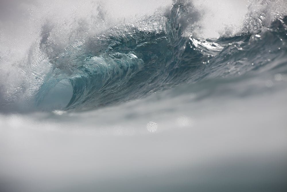
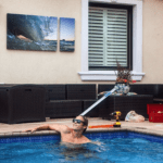
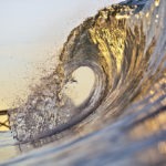
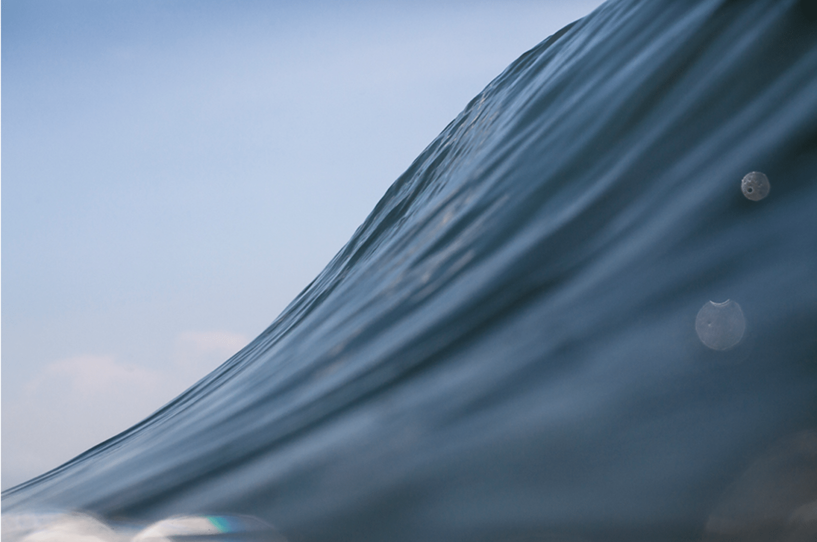
expensive cameras and waterproof housings. 

My frustration ended abruptly on a trip to the National Gallery of Art in Washington, DC.  There,  I found a very large canvas with fields of flat, solid color spread across and stained into the canvas.  These abstract, symmetrical rectangular blocks of two to three opposing or contrasting complementary colors touched me and spoke to deep human emotions.  Here, the color felt freed from the objective context and became the subject in itself.  Shortly after this experience I said to myself, “these are the same visions I see in the ocean everyday!!”

Then and there, the “Rothko Project” was born and ever since I have been on the hunt for seascapes that hold strong emotions, both positive and negative, imbedded in large blocks of natural  color.  As this project is a work in progress, I invite you to view the images below as they are the start of my newest body of work inspired by the color field paintings of Mark Rothko.


When presented with the opportunity to install any work of my choosing for a billboard size (8’x19′) installation above Sweetwater Surf Shop in the heart of Wrightsville Beach NC, a few major questions came to mind. What am I going to show?  What kind of statement do I want to make? How am I going to make the piece fit this unique space? After contemplation, I discovered the answers to these tough questions in the guiding principles of minimalism, forced perspective, and color theory.

minimalism: Given that the space is very large and outdoors, special considerations needed to be made as to how the piece would look when viewed at various distances.  Due to this factor, I determined a piece with minimal content structure would be best to extend visual impact to all at multiple distances, so as not to confuse the viewer with content from afar.  This “less is more” approach also made sense when considering the necessity of the work to complement the organic line structure of the building.  The chosen piece must have strong geometric components.

forced perspective: To hold elements of the modern, I needed to chose a piece that manipulated perspectives when the scale was enlarged. Currently, my methodical approach to ocean photography is centered on the technical use of forced perspective.  I implement this technique through the use of unconventional lenses that compress and manipulate the scale of the water in motion.  As these images are enlarged, their ability to produce the illusion of size increases with the of the size of the installation.  For example, a 2′ wave shot with the applied techniques and enlarged to scale at 18′ in length will hold the visual illusion of an 18′ wave.

color theory: Finally, since the work will be in a predominantly blue environment (the building is blue, the sky is blue, etc.) I determined that a blue monochromatic image would be essential to harmony and flow.  A further point regarding the use of blue is that it is recognized as the most preferred color of humans across cultures worldwide when compared to all colors in the color wheel.
Utilizing this self imposed three-point checklist, the work that I need to show became crystal clear to me.  See my selection installed above this text and in it’s full frame below.

-Sean D. Ruttkay

Sea Line